[Edit: more explanation for second plot.]
In part 1, I showed some raw temperature data for a few different cities I’ve lived in. I also had a plot of the daily average temperature over a year for the cities. Code for making the plots are here.
The goal of this project is to try and understand why my perception of the weather in the Bay Area is so different from other places I’ve lived. This post will start to look into the question of daily temperature fluctuations versus annual temperature fluctuation.
The first way I thought of to visualize this question was to look at a plot of 1:the difference between the daily highs and lows versus 2:the difference between the highest temperature in a year. I can measure the mean value and standard deviations of both of these quantities.

For each city, I’ve plotted the mean of the differences described above and the shaded ellipses show the standard deviation of the quantities.
One thing becomes very clear from this plot: there is something very different about Detroit and Ithaca compared to the Bay Area cities. I was surprised that the daily fluctuations for Oakland and SF were smaller than the ones in Detroit and Ithaca, but it is clear that they are still relatively large compared to the annual fluctuations.
This plot made me think that it might be interesting to not only try and compare the daily and annual fluctuations, but the fluctuations for timescales in between as well. The power spectrum of the temperatures can be used to measure these fluctuations across different time scales.
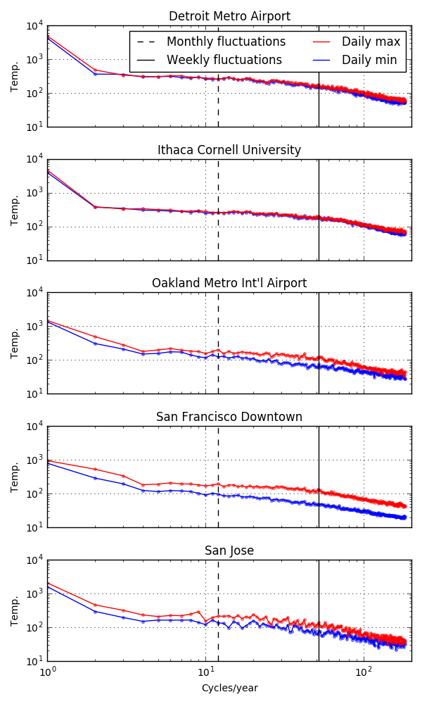
The y-axis of this plot is proportional to the amplitude of the `temperature fluctuations at a given time scale. The x-axis are the different timescales (log-scale) from annual fluctuations on the left (1 per year), to day-to-day fluctuations on the right (365/2 per year). I’ve also marked the monthly and weekly fluctuations with the vertical lines.
I noticed a few things from these plots. For Ithaca and Detroit, the short-timescale fluctuations seem to be similar for the daily highs and daily lows and there is only much of a difference in the annual timescales (and maybe a little bit sub-weekly, I haven’t done any careful stats). In contrast, in the Bay Area there are noticeable differences between daily highs and lows across timescales which are pretty prevalent at about the week timescale. Detroit and Ithaca also have a large kink at 2 cycles/year which means that temperature fluctuations at annual timescales are much larger than any of the shorter timescales. For the Bay Area, it’s a much more smooth transition.
This still does quite answer the question I’m interested in, and there is one more analysis I’ll describe which, I think, gets at why the Bay Area weather is weird.