In 2017, I ran a small set of experiments that asked the question: if the US Senate demographics were the results of a fair process, how (un)likely would the 2017 US be? Spoiler alert: not very likely to come from a fair process in 2017.
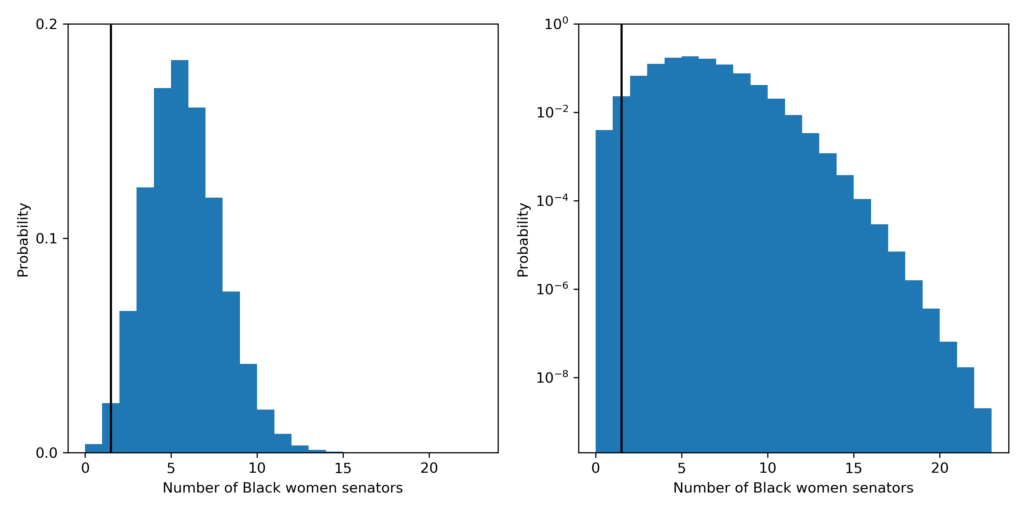
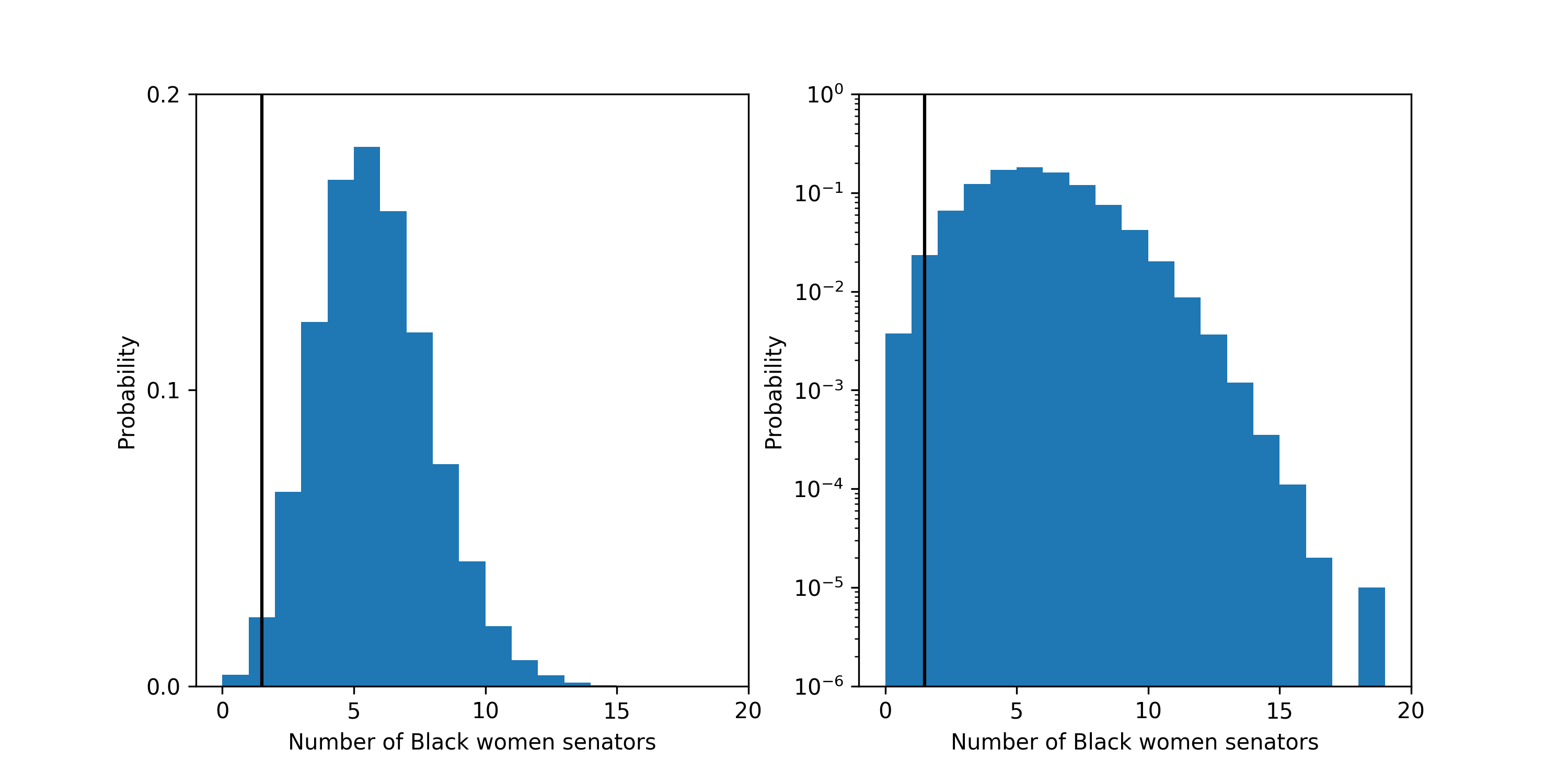
First, let’s look at what the probability is that a fair process produced a Senate with 1 or fewer Black women senators. The probability is about 2.7 in 100. The most likely outcome predicted by a fair process is 5 Black women senators which should happen 18% of the time.
The probability distribution for the number of Black women senators under the fair model. Left plot is linear y-scale and right plots is log y-scale. The vertical black line shows the current number of Black women: 1, in the Senate.
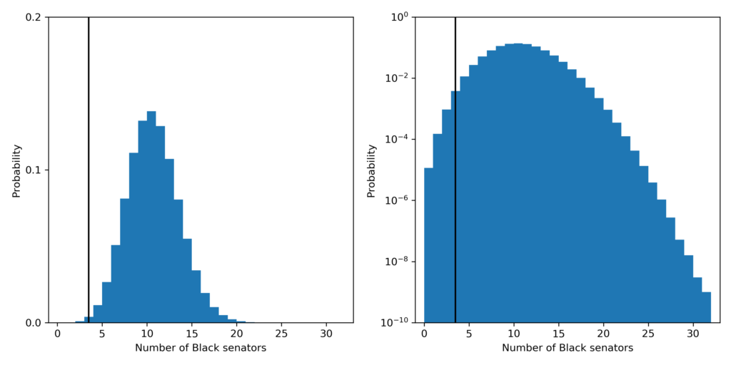
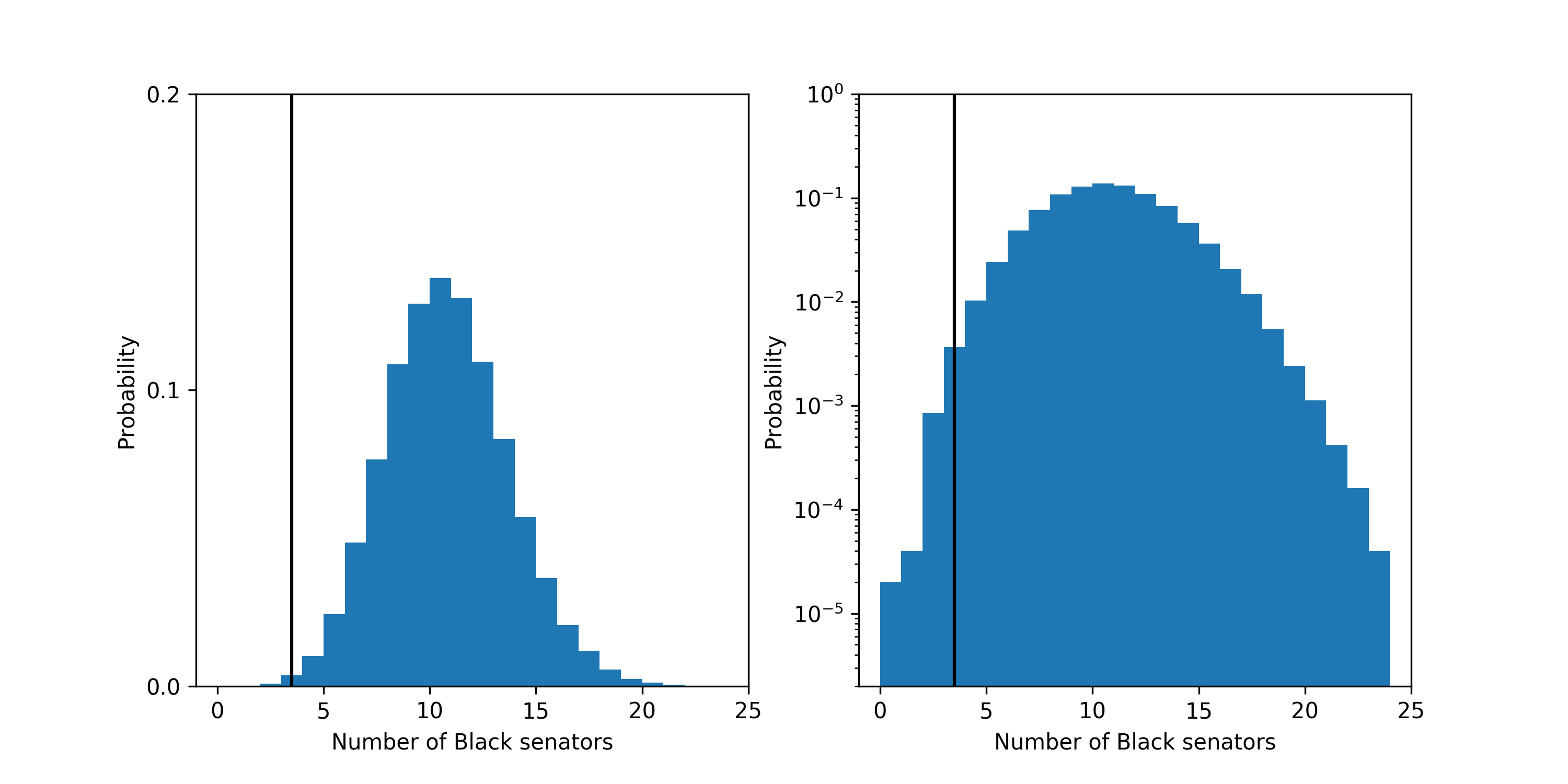
The probability that a fair process led to a Senate with 3 or fewer Black senators is about 4.9 in 1,000. The most likely outcome predicted by a fair process is 10 Black senators which should happen about 14% of the time.
The probability distribution for the number of Black senators under the fair model. Left plot is linear y-scale and right plots is log y-scale. The vertical black line shows the current number of Black people: 3, in the Senate.
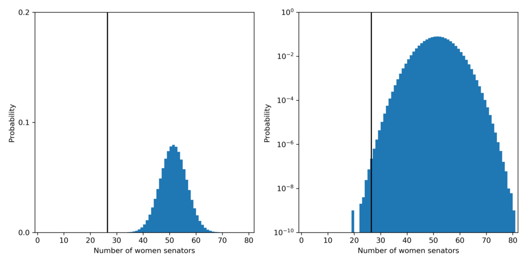
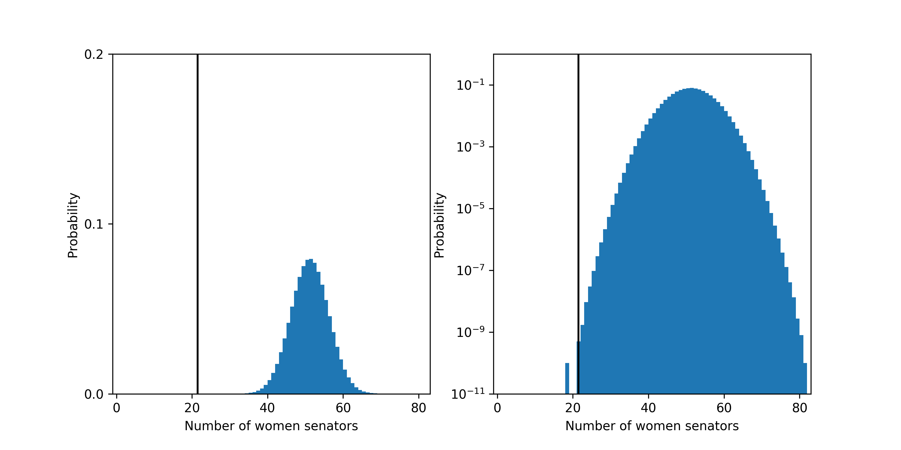
The probability that a fair process led to a Senate with 26 or fewer women senators is about 3 in 10,000,000! The most likely outcome predicted by a fair process is 51 women senators which should happen about 8% of the time.
The probability distribution for the number of women senators under the fair model. Left plot is linear y-scale and right plots is log y-scale. The vertical black line shows the current number of women: 26, in the Senate.
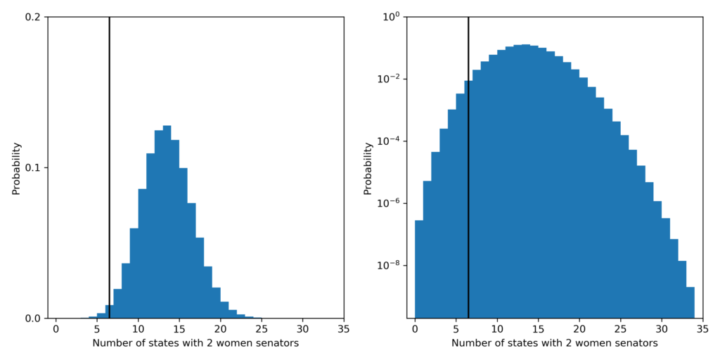
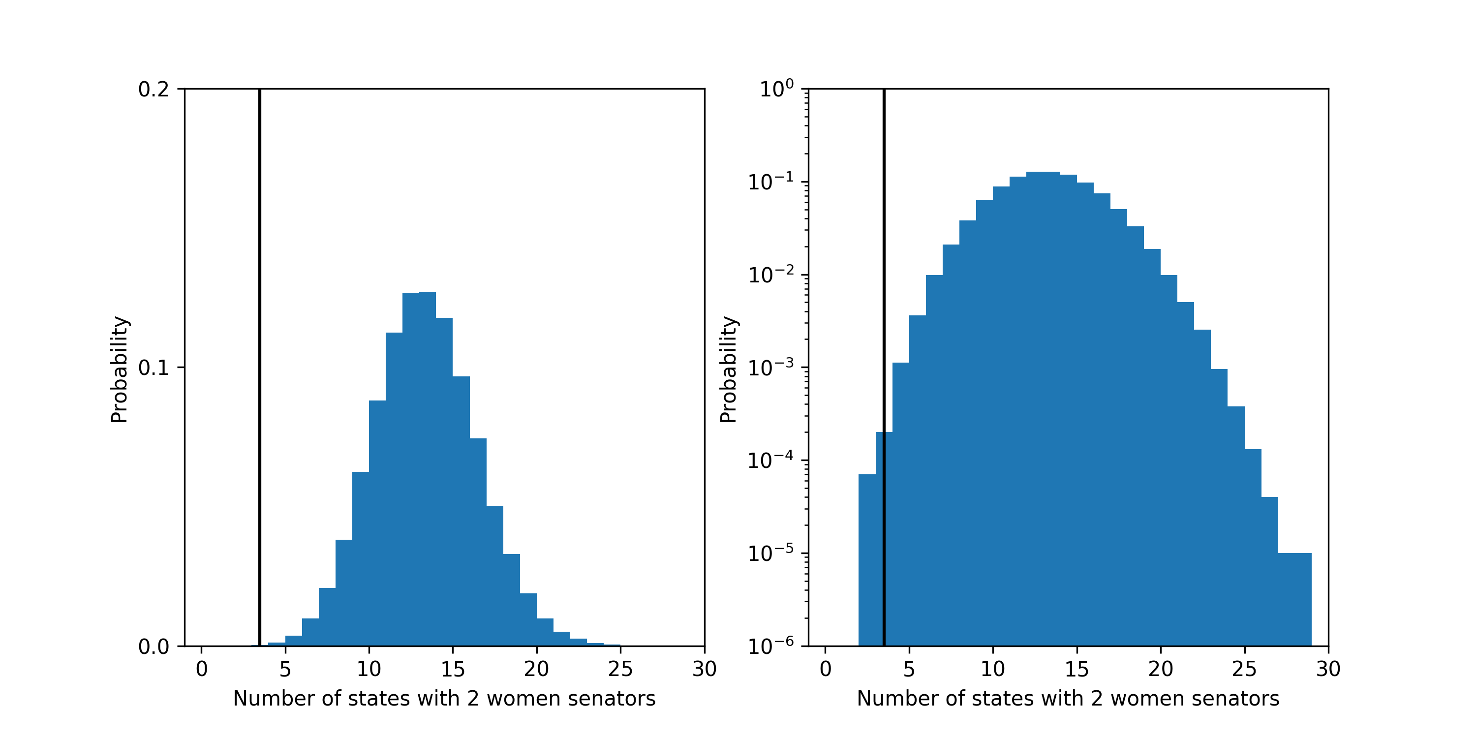
Finally, the probability that a fair process led to a Senate with 3 or fewer states with 2 women senators is about 1.3 in 100. The most likely outcome predicted by a fair process is 13 states with 2 women senators which should happen about 13% of the time.
The probability distribution for the number of states with 2 women senators under the fair model. Left plot is linear y-scale and right plots is log y-scale. The vertical black line shows the current number of states: 6, in the Senate.
So what’s changed? Broadly, this shows that becoming a US Senator is not a fair process. It it biased against non-Black women, Black people and Black women. The number of women has significantly increased, but is still not close to a fair fraction. The number of Black senators and Black women senators has not changed. Still more work to do!
You can find the data and code to reproduce these plots here.
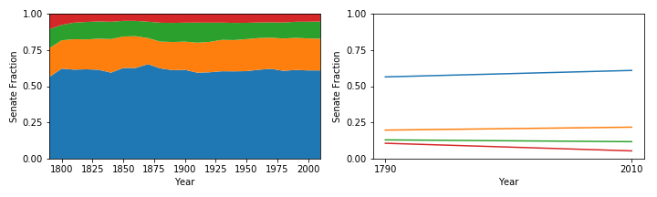
Do we in the US still have the same Senate as it existed in 1790 (first census)? I’ll attempt to answer this question with regards to one particular attribute: the division of senators by percentiles of the population. Unlike the House, the Senate is not meant to represent states proportional to their population; each state gets 2 senators. When this system was created, the states had some distribution of large and small populations. Over time, the number of states and their populations have changed.
When the Senate was created, it was known that it would represent states but not individuals equally. This might be a reasonable system if the states’ populations are not too skewed [1]. It does become an obviously ridiculous system in the skewed limit. If a state lost enough residents such that its population became 2, it would be pretty bizarre to have them both as senators and have one senator represent one person’s vote. How skewed are we and has this changed since the late 1700s?
A simple way of answering this question is to break the US’s population into percentiles by how many senate votes they have. We’ll do this for four percentiles: 0-25%, 25-50%, 50-75%, and 75-100%. 0-25% percentile is the 25% percent of the population which has the largest fraction of a Senate vote, i.e. the 25% of the US population from the states with the smallest populations. This same process applies for the next 3 percentiles. If we know the population of the states [2] over time (available through the census), we can calculate the percentiles.
What does this look like for the 1790 through 2010 censuses?
The plot on the left shows the four percentile divisions over time since the 1790 census. The plot on the right is lines connecting the fractions per division (not stacked) for 1790 and 2010 only.
The large blue area is the fraction of Senate seats going to the top 25% of the population (most Senate representation). It has hovered just over 60% of the Senate vote and has increased about 4% from 1790 to 2010 (much of that happened in the first decade).
The next orange and green areas show the next two percentiles which have increased by 2% and decreased by 1% respectively.
The small red area is the fraction of Senate seats going to the bottom 25% of the population (least Senate representation). It has hovered around 5% of the Senate vote and has decreased about 4% from 1790 to 2010 (much of that happened in the first decade).
This means that the top and bottom 25%s of the country currently have a 10x disparity in Senate representation.
And over time, the 50% of people who live in the smallest states, i.e. have the most Senate representation, have about 6% more voting power (equivalent to 6 more senators) in the Senate compared to 1790. Conversely, the 50% of people who live in the largest states, i.e. have the least Senate representation, have lost about 6% (lost 6 senators). I’ve rounded to whole numbers, so things don’t exactly add up as I’ve presented.
Recent trends
These percentiles move around a lot in the first 100 years of the US and those trends probably are not still happening today. What about if we look at the last 50 years?
In the last 50 years, the 50% of the population with the most representation in the Senate (smallest states) have had no significant change in representation. The 25% of the population with the least Senate representation have lost about .2% of a Senate seat per decade and the 25% with the second least representation have gained about .3% of a Senate seat per decade.
So the two main conclusions are one: that there is a large degree of skewness (~10x) in Senate representation, and two: that this has been relatively stable except for the 25% of the population with the least Senate representation (largest states) which has lost about half of its representation since 1790.
Notes
[1] I’m not commenting here on whether having the Senate as a congressional body is or was a good idea, just whether that body has changed over time in this particular way.
[2] I’ve removed the enslaved population in states since they had no representation.
Code to reproduce these plots (and more!) can be found here.
At first glance, it looks like the demographics of the US Senate are not representative of the US as a whole; the demographic percentages are not very similar to the Senate percentages. But how can we check this quantitatively? The p-value, a simple metric coined by statisticians, is commonly used by researchers in science, economics, sociology, and other fields to test how consistent a measurement or finding is with a model of the world they are considering.
It’s important to note that this is an overly simplistic picture of demographics. This categorization of gender and race leaves out many identities which are common. This simplified demographic information happens to be easy to come by, but this analysis could easily be extended to include more nuanced data on gender and race, disability identity or sexual orientation, or other factors like socio-economic background, geography, etc. if it is available for the Senate and the state populations.
First, a bit of statistics and probability background.
Randomness and biased coin flips
In many domains (physics, economics, sociology, etc.) it is assumed that many measurements or findings have an element of randomness or unpredictability. This randomness can be thought of as intrinsic to the system, as is often the case in quantum mechanics, or as the result of missing measurements, e.g. what I choose to eat for breakfast on Tuesday might be more predictable if you know what I ate for breakfast on Monday. Another simple example is a coin flip: if the coin is “fair” you know that you’ll get heads and tails half of the time each, but for a specific coin flip, there is no way of knowing whether you’ll get heads or tails. It turns out that sub-atomic particle interactions, what you buy at the supermarket on a given day, or who becomes part of your social circle all have degrees of randomness. Because of this randomness, it becomes hard to make exact statements about systems that you might study.
For example, let’s say you find a quarter and want to determine whether the coin was fair, i.e. it would give heads and tails half of the time each. If you flip the coin 10 times, you might get 5 heads and 5 tails, which seems pretty even. But you might also get 7 heads and 3 tails. Would you assume that this coin is biased based on this measurement? Probably not. One way of thinking about this would be to phrase the question as: what are the odds that a fair coin would give me this result? It turns out that with a fair coin, the odds of getting 5 heads is about 25% and the odds of getting 7 heads is about 12%. Both of these outcomes are pretty likely with a fair coin and so neither of them really lead us to believe that the coin is not fair. Try flipping a coin 10 times; how many heads do you get?
Let’s say you now flip the coin 100 times. The odds of getting 50 heads is about 8%. But the odds of getting 70 heads is about .002%! So if you rolled 70 heads, you would only expect that to happen 2 out of every 100,000. That’s pretty unlikely and would probably lead you to believe that the coin is actually biased towards heads.
This quantity: the odds that a model (a fair coin in this example) would produce a measurement or finding (70 heads in this example) is often called a p-value. We can use this quantity to estimate how likely it is that the current US Senate was generated by a “fair” process. In order to do that, we’ll first need to define what it means (in a probabilistic sense) for the process of selecting the US Senate to be “fair”. Similarly, we had to define that a “fair” coin was one that gave us equal odds of heads and tails for each toss. Now you can start to apply this tool to the Senate data.
What is “fairness” in the US Senate
I’m going to switch into the first person for a moment since the choices in this paragraph are somewhat subjective. I have a particular set of principles that are going to guide my definition of “fair”. You could define it in some other way, but it would need to lead to a quantitative, probabilistic model of the Senate selection process in order to assess how likely the current Senate is. The way I’m going to define “fair” representation in the US Senate comes from the following line of reasoning. I believe that, in general, people are best equipped to represent themselves. I also believe that senators should be representing their constituents, i.e. the populations of their states. Taking these two things together, this means that I think that the US Senate should be demographically representative on a per-state basis. I don’t mean this strictly such that since women are 51% of the population there should be exactly 51 women senators, but in a random sense such that if a state is 51% women, the odds of electing a woman senator should be 51%. See the end of this post for a few assumptions this model makes.
Given this definition of “fair”, we can now assess how likely or unlikely is it that a fair process would lead to the Senate described above: 1 Black woman senator, 3 Black senators, 21 women senators, or 3 states with 2 women senators. To do this we’ll need to get the demographic information, per state, for the fraction of the state that is women and Black. I’m getting this information from the 2010 Census. It is possible to calculate these probabilities exactly, but it becomes tricky because, for instance, there are many different ways that 21 women could be elected (there are about 2,000 billion-billion different ways), and so going through all of them is very difficult. Even if you could calculate 1 billion ways per second, it would still take you, 60,000 years to finish. If we just want a close approximation to the probability, we can use a trick called “bootstrapping” in statistics. This works by running many simulations of our fair model of the Senate and then checking to see how many of these simulations have outcomes like 21 women senators or 3 Black senators. Depending on how small the probabilities we are interested are, we can often get away with only running millions or billions of simulations, which seems like a lot but is much easier than having to do many billion-billion calculations and can usually be done in a matter of minutes or hours.
The core process of generating these simulations is equivalent to flipping a bunch of biased coins. For each state, we know the fraction of the population which are women and/or Black. So, for each of the two Senate seats per state, we flip two coins. One coin determines gender and the other race. We can then do this for all 50 states. Now we have one simulation and we can check how many Black women senators or states with 2 women senators, etc., we have. We can then repeat this process millions or billions of times so that we can estimate the full distribution of outcomes. Once we have this estimated distribution, we can check to see how often we get outcomes as far away or further from the expected average.
So, what are the odds?
So what do the results look like? I’m going to present two plots side-by-side which show the same information in two ways. The plots on the left will show the distributions of expected outcomes the fair process predicts as blue histograms and where the current Senate value falls in that distributions as a black vertical line. The plots on the right will show the same information with the y-axis log-scaled. This will make it easier to see very small probabilities, but also visually warps the data to make small probabilities appear larger than that really are. If you’re not used to looking at log-scale plots, the plot on the left gives the clearest picture of the data. Data and code to reproduce these figures can be found here.
First, let’s look at what the probability is that a fair process produced a Senate with 1 or fewer Black women senators. The probability is about 2.7 in 100. The most likely outcome predicted by a fair process is 5 Black women senators which should happen 13% of the time.
The probability distribution for the number of Black Women senators under the fair model. Left plot is linear y-scale and right plots is log y-scale. The vertical black line shows the current number of Black women: 1, in the Senate.
The probability that a fair process led to a Senate with 3 or fewer Black senators is about 4.6 in 1,000. The most likely outcome predicted by a fair process is 10 Black senators which should happen about 14% of the time.
The probability distribution for the number of Black senators under the fair model. Left plot is linear y-scale and right plots is log y-scale. The vertical black line shows the current number of Black people: 3, in the Senate.
The probability that a fair process led to a Senate with 21 or fewer women senators is about 6 in 10,000,000,000! The most likely outcome predicted by a fair process is 51 women senators which should happen about 8% of the time.
Finally, the probability that a fair process led to a Senate with 3 or fewer states with 2 women senators is about 3 in 10,000. The most likely outcome predicted by a fair process is 13 state with 2 women senators which should happen about 13% of the time.
The probability distribution for the number of states with 2 women senators under the fair model. Left plot is linear y-scale and right plots is log y-scale. The vertical black line shows the current number of states: 3, in the Senate.
These odds together show that it is very unlikely that the process for selecting US senators is fair according the the definition I have chosen. Now the question becomes: how does this disparity arise?
There is a wealth of evidence that shows how this comes about, such as segregation in schools and housing, unequal access to employment and social networks, gerrymandering, racial discrimination in voting through voter ID laws, and the repeal of portions of the voting rights act, just to name a few.
Nate Silver did a bit of analysis to trying to understand this (thanks for the reference, Peter). In 2009, he wrote a post titled: Why Are There No Black Senators? The main finding is that there is a nonlinear relationship between district demographics and House representative demographics. If a district is less than about 35% Black, the district has a lower probability of electing a Black rep. than would be expected by demographics. Conversely, if a district is more than about 35% Black, it is slightly more likely to elect a Black representative than would be expected by demographics. Unfortunately, I think he does a fairly bad job at trying to explain the finding, but the finding itself is interesting.
Silver then asks whether these racial biases in House voting patterns can explain the lack of Black senators.
They essentially do. Since states are more homogeneous than House districts, the fraction of state populations that are Black are much smaller than 35%. In fact, only one state has more than a 35% Black population (Mississippi at 37%). This means that Silver’s model predicts that there should only be about 1 Black senator, which is consistent with the 0 Black senators at the time and the 3 Black senators now. That data wasn’t published with the article, so it’s hard to say what the exact odds of 0 or 3 would be, but approximating it as a Poisson distribution gives 30% and 10% respectively.
Another way of trying to get at this question is to split the process of becoming a senator into two parts and look for bias in the parts individually. The first is the path that leads people to becoming candidates for Senate seats and the second is the election process which choses senators from this pool. This data is not easily available on the internet as far as I can tell (Let me know if that’s not true!), but would shed more light on where the biases are coming in to the process.
Assumptions and comments
A few assumptions that I am making:
the 2010 demographics are similar to the demographics of today,
the product of the gender and race fractions give the gender-race fractions per state,
the census demographics are similar to the demographics of those eligible to be a senator per state, and
that all senators are elected at once.
I’ve compared assuming flat demographics across states and the data that I use above and the p-values fluctuated up or down about a factor of 2 or 3. If I could get data that doesn’t make the above assumptions, I wouldn’t expect anything to change by more than another factor of 2 or 3 up or down.
Edit: The 6 in 10,000,000,000 statistic is probably not super accurate since it happens so rarely (it’s way out in the tail of the distribution). I’m confident that it is smaller than 1 in 100,000,000 but wouldn’t claim the number I’m reporting is super accurate.
And a comment:
The statement “I believe that, in general, people are best equipped to represent themselves” needs a bit of unpacking. I would probably add the condition that, given equal access to resources, people are generally best equipped to represent themselves. I also think the idea that “some people are intrinsically more likely to want to be a senator” is kind of the reverse of the way I’m looking at the problem. Representatives and senators should represent their constituents. Given that I also think that people are best equipped to represent themselves, the jobs of Congress should be adapted so that more people could fulfill them. Congress already receives a ton of support from staff and experts, so it is not clear to me that it requires a particular set of skills or level of expertise apart from the intention to represent your constituents.
Thanks to Sarah for edits and feedback! Thanks Mara, Papa, and Dimitri for catching some typos!