Categories
Data Analysis Politics Thoughts

How has representation in the Senate changed over time?

Do we in the US still have the same Senate as it existed in 1790 (first census)? I’ll attempt to answer this question with regards to one particular attribute: the division of senators by percentiles of the population. Unlike the House, the Senate is not meant to represent states proportional to their population; each state gets 2 senators. When this system was created, the states had some distribution of large and small populations. Over time, the number of states and their populations have changed.

When the Senate was created, it was known that it would represent states but not individuals equally. This might be a reasonable system if the states’ populations are not too skewed [1]. It does become an obviously ridiculous system in the skewed limit. If a state lost enough residents such that its population became 2, it would be pretty bizarre to have them both as senators and have one senator represent one person’s vote. How skewed are we and has this changed since the late 1700s?

A simple way of answering this question is to break the US’s population into percentiles by how many senate votes they have. We’ll do this for four percentiles: 0-25%, 25-50%, 50-75%, and 75-100%. 0-25% percentile is the 25% percent of the population which has the largest fraction of a Senate vote, i.e. the 25% of the US population from the states with the smallest populations. This same process applies for the next 3 percentiles. If we know the population of the states [2] over time (available through the census), we can calculate the percentiles.

What does this look like for the 1790 through 2010 censuses?

The plot on the left shows the four percentile divisions over time since the 1790 census. The plot on the right are lines connecting the fractions per division (not stacked) for 1790 and 2010 only.
The plot on the left shows the four percentile divisions over time since the 1790 census. The plot on the right is lines connecting the fractions per division (not stacked) for 1790 and 2010 only.

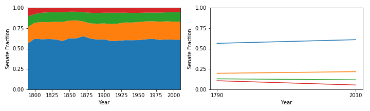
The large blue area is the fraction of Senate seats going to the top 25% of the population (most Senate representation). It has hovered just over 60% of the Senate vote and has increased about 4% from 1790 to 2010 (much of that happened in the first decade).

The next orange and green areas show the next two percentiles which have increased by 2% and decreased by 1% respectively.

The small red area is the fraction of Senate seats going to the bottom 25% of the population (least Senate representation). It has hovered around 5% of the Senate vote and has decreased about 4% from 1790 to 2010 (much of that happened in the first decade).

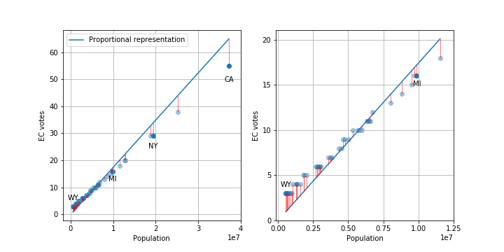
This means that the top and bottom 25%s of the country currently have a 10x disparity in Senate representation.

And over time, the 50% of people who live in the smallest states, i.e. have the most Senate representation, have about 6% more voting power (equivalent to 6 more senators) in the Senate compared to 1790. Conversely, the 50% of people who live in the largest states, i.e. have the least Senate representation, have lost about 6% (lost 6 senators). I’ve rounded to whole numbers, so things don’t exactly add up as I’ve presented.

Recent trends

These percentiles move around a lot in the first 100 years of the US and those trends probably are not still happening today. What about if we look at the last 50 years?

In the last 50 years, the 50% of the population with the most representation in the Senate (smallest states) have had no significant change in representation. The 25% of the population with the least Senate representation have lost about .2% of a Senate seat per decade and the 25% with the second least representation have gained about .3% of a Senate seat per decade.

So the two main conclusions are one: that there is a large degree of skewness (~10x) in Senate representation, and two: that this has been relatively stable except for the 25% of the population with the least Senate representation (largest states) which has lost about half of its representation since 1790.

Notes

[1] I’m not commenting here on whether having the Senate as a congressional body is or was a good idea, just whether that body has changed over time in this particular way.
[2] I’ve removed the enslaved population in states since they had no representation.

Code to reproduce these plots (and more!) can be found here.

Categories
Data Analysis Thoughts

The electoral college is states vs. federal, not urban vs. rural

The electoral college (EC) is the system used in the US to determine how individual’s votes for president get turned into the numbers that actually determine who becomes president. Each state and D. C. is allocated a number of electors based partially on the population of the state from the last census. The number of electors is equivalent to the number of senators + the number of representatives for each state (D. C. gets 3), see here for details about how the allocations are calculated.

I’ve heard people say that one of the things the EC does is prevent voters in the cities from dominating rural voters. This has always seemed a bit odd to me since, on its face, the allocation is just based on state populations and not demographics. So, I decided to look at the relationship between rural, urban, and total population and how they related to the number of electoral college votes. The code and data for reproducing the plots are here. This is all based on 2010 Census data.

OK, first let’s just look at how many EC votes each state gets. There are a total of 538 electors. The plot below shows the distribution of votes for each state along with a line showing the number each state would be allocated if it was done exactly proportional to population. I’ve labeled a few states of interest.

Plots of the number of electoral college votes per state. Plot on the right in an inset of the bottom left corner of the plot on the left. Blue line is the number of votes states would have if the number of votes was proportional. The red vertical lines are the differences between the proportional number and actual number. (click to get larger version)

As you can see, states with smaller populations tend to have larger than proportional representation and larger states have fewer votes.

We can look at the number of electoral votes that different people get, i.e. how much is your vote worth in a presidential election. I’m leaving out a lot of important details, like racist voter suppression, the number of actual people able to vote in each state versus total population, and changes in population/demographics since 2010. Given the 538 electors and the 2010 population of 308,745,538, the average person gets. 1.7e-6 or 1.7 millionths of a vote. But, this will vary state-to-state based on the number of electors allocated to each state.

EC votes per person for different states and D.C.. Plotted against total state population, rural population, and urban population (rural and urban add up to total). (click to get larger version)

As you can see, the number of EC votes per person varies from about 1.5 millionths (California) to 5.3 millionths (Wyoming), about a factor of 3.5. State with populations above about 10 million all have similar EC votes per person, but small states can have much larger votes per person.

The solid blue line is the national average EC votes per person (1.74 millionths), the solid green line is the national average EC votes for someone living in a urban area (1.72 millionths, barely below the blue line), and the solid orange line is the national average EC votes for someone living in a rural area (1.85 millionths). So, on average, a person living in a rural area has about 8 percent more voting power compared to someone living in an urban area.

But!, the 601,723 people living in urban D. C. have 338 percent more voting power than the 1,880,350 people living in a rural area of California.

Finally, let’s look at how the total state population correlates to the fraction of people living in rural areas.

Fraction of population which lives in rural areas versus total population. There is a trend that states with larger populations tend to have a smaller fraction of people living in urban areas. For states with a total population less than than 10 million, there is much more variance in the fraction of people living in urban areas.

This shows that there is indeed a negative correlation, i.e. smaller states tend to have more people living in rural areas (this leads to the 8 percent difference above).

The thing that I take away from all of this is that the electoral college is actually weighting your vote as a member of the US lower than your vote as member of your state. Because of the current state demographics, it also weights rural votes slightly higher than urban votes, but this is a very small effect compared to the small state versus large state effect (8 vs. 350 percent). So, if you currently live in a big city in California, New York, or Texas and want your vote for president to have more impact, you’ll get more value for your vote if you move to an urban area in Wyoming, D. C., or Vermont rather than a rural area of your state,  although you can still have an impact on House and state reps within your state.

I should also note that all of this analysis misses a larger problem of the electoral college: most states have a winner-take-all system where the candidate with the popular majority takes 100 percent of the electoral votes. This means that a candidate who wins 51 percent of the votes in a state gets 100 percent of the EC votes. This system is also used for state reps. and when coupled with gerrymandering, can lead to skews in the state representation compared to state voting demographics.

Edit: Thanks Dylan for catching some spelling errors!

Categories
Data Analysis Thoughts

The Bay Area has weird weather: part 3

I started this series of posts to understand why the weather in the Bay Area seems different than weather in the places I’ve previously lived. In this post, I’ll show one analysis that I think answers this question. As a reminder, in part 1, I showed some basic visualization of the raw data and an annual summary. In part 2, I went over two analyses that showed that the Bay Area has different weather as compared to Detroit and Ithaca, but neither really got at the heart of why my experience was different.

In this post I’ll present two more analyses. The first shows another interesting difference between the Bay Area and Detroit and Ithaca. The second post really gets at the question that I’ve been trying to answer and introduces the jacket crossing probability (something I made up).

Based on the power-spectrum analysis in part 2, I decided to look in more detail at the daily fluctuations (right side of the plot). For any given day of the year in a city, say May 17th, there is an average temperature, maybe 70 degrees. In addition to the average, there are also the year-to-year fluctuations. These fluctuations can be averaged over all days in a year and plotted.

Again, the Bay Area looks very different than Detroit and Ithaca. The distributions of daily high and low fluctuations for Detroit and Ithaca both look very symmetric and fairly Gaussian. The fluctuations have a standard deviation of about 15 degrees and look almost identical for the daily highs and lows. In contrast, the Bay Area distributions are much narrower, with standard deviations less than 10 degrees for all highs and lows. The daily highs tend to have their modes skewed towards lower temperature with longer tails into the highs. The daily low temperatures tend to be more symmetric and have smaller standard deviations. This means that each day’s daily high or low is more predictable in the Bay Area.

Now, to really get at the question of why the Bay Area’s weather is weird I came up with a metric I’m calling the jacket crossing probability: for a given day, what are the odds that the daily high is above and temperature where I’d want a jacket and the daily low is below that temperature. We can plot this probability for all days.

I personally need a jacket when it gets below 60 degrees. If I set this as the threshold, I get the above jacket crossing probabilities. So, Detroit and Ithaca only have two relatively short periods where, with greater than 50% odds, you’ll both want and not want a jacket. They align with late spring and late fall. Similar periods for Oakland and San Francisco extend from spring through summer and into fall. In San Jose, this period extends for almost the entire year outside. So, in the Bay Area, the annoying time when you might both want and not want a jacket extends for the better part of the year. In Detroit and Ithaca, summers are hot and winters are cold and you can prepare for the entire day easily. I think these plots really get at the differences in weather I’ve experienced in the Bay Area.

I’ll follow up with maybe one more post with some additional analyses that others have suggested or done themselves (yay for collaboration!).

Categories
Data Analysis Thoughts

The Bay Area has weird weather: part 2

[Edit: more explanation for second plot.]

In part 1, I showed some raw temperature data for a few different cities I’ve lived in. I also had a plot of the daily average temperature over a year for the cities. Code for making the plots are here.

The goal of this project is to try and understand why my perception of the weather in the Bay Area is so different from other places I’ve lived. This post will start to look into the question of daily temperature fluctuations versus annual temperature fluctuation.

The first way I thought of to visualize this question was to look at a plot of 1:the difference between the daily highs and lows versus 2:the difference between the highest temperature in a year. I can measure the mean value and standard deviations of both of these quantities.

For each city, I’ve plotted the mean of the differences described above and the shaded ellipses show the standard deviation of the quantities.

One thing becomes very clear from this plot: there is something very different about Detroit and Ithaca compared to the Bay Area cities. I was surprised that the daily fluctuations for Oakland and SF were smaller than the ones in Detroit and Ithaca, but it is clear that they are still relatively large compared to the annual fluctuations.

This plot made me think that it might be interesting to not only try and compare the daily and annual fluctuations, but the fluctuations for timescales in between as well. The power spectrum of the temperatures can be used to measure these fluctuations across different time scales.

Annual temperature power spectrum for different cities.

The y-axis of this plot is proportional to the amplitude of the `temperature fluctuations at a given time scale. The x-axis are the different timescales (log-scale) from annual fluctuations on the left (1 per year), to day-to-day fluctuations on the right (365/2 per year). I’ve also marked the monthly and weekly fluctuations with the vertical lines.

I noticed a few things from these plots. For Ithaca and Detroit, the short-timescale fluctuations seem to be similar for the daily highs and daily lows and there is only much of a difference in the annual timescales (and maybe a little bit sub-weekly, I haven’t done any careful stats). In contrast, in the Bay Area there are noticeable differences between daily highs and lows across timescales which are pretty prevalent at about the week timescale. Detroit and Ithaca also have a large kink at 2 cycles/year which means that temperature fluctuations at annual timescales are much larger than any of the shorter timescales. For the Bay Area, it’s a much more smooth transition.

This still does quite answer the question I’m interested in, and there is one more analysis I’ll describe which, I think, gets at why the Bay Area weather is weird.

Categories
Data Analysis Thoughts

The Bay Area has weird weather

[Update: removed San Diego]

The weather in the San Francisco Bay Area is weird. At least it is weird compared to most of the other places I’ve lived in the US. In the suburbs of Detroit where I grew up and in upstate New York where I went to college, you could be comfortable in the same clothes basically all day or night. If you’ve ever been to the Bay Area, you know that this is not true. It can be in the 50s in the morning and evening and then 80 during the day.

So, I’ve always thought that the Bay Area must have larger daily temperature swings relative to the seasonal swings compared to other places I’ve lived. I wanted to find some historical data to look at this phenomenon and finally found it at the National Oceanic and Atmospheric Administation (NOAA) website, which has a nice search function for different databases.

I finally got around to downloading some data for cities that I’ve lived in or near. I’ll write a few posts looking at the data and also exploring different ways of visualizing the data.

You can find the analysis and plotting code I’m writing on my github here. It’s a work in progress, so there’ll be more updates and cleanup.

This first post is basically just trying to take a broad look at the data. So, first I just want to plot all of the data for each city. Click on the plot for a larger version. The first plot as the daily high (red) and daily low (blue) along with a local median filtered version (darker squiggly line) and the average over all time (darker straight horizontal line) for the high and low temps. The y-axes are all the same, but notice that the x-axes have different numbers of years.

From this plot I noticed a few things. Different cities have very different annual temperature swings. But, some cities have much larger separation between the daily minimum and maximum. In fact, for San Jose, it looks like the daily swings are almost as large and the annual swings!

We can also look at the data where we take the average for a year. These plots show the daily average maximum and minimum temperatures (top and bottom of red shaded area) and the halfway point (black line). Again, we can see that some cities have large annual swings (Detroit and Ithaca) and the Bay Area has a relatively small annual swing. In the next post, I’ll do a more careful comparison of the daily and seasonal swings!

Part 2 is here.