[Update: removed San Diego]
The weather in the San Francisco Bay Area is weird. At least it is weird compared to most of the other places I’ve lived in the US. In the suburbs of Detroit where I grew up and in upstate New York where I went to college, you could be comfortable in the same clothes basically all day or night. If you’ve ever been to the Bay Area, you know that this is not true. It can be in the 50s in the morning and evening and then 80 during the day.
So, I’ve always thought that the Bay Area must have larger daily temperature swings relative to the seasonal swings compared to other places I’ve lived. I wanted to find some historical data to look at this phenomenon and finally found it at the National Oceanic and Atmospheric Administation (NOAA) website, which has a nice search function for different databases.
I finally got around to downloading some data for cities that I’ve lived in or near. I’ll write a few posts looking at the data and also exploring different ways of visualizing the data.
You can find the analysis and plotting code I’m writing on my github here. It’s a work in progress, so there’ll be more updates and cleanup.
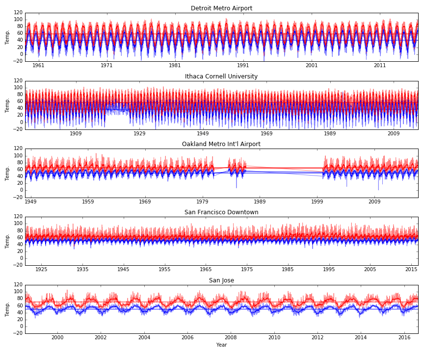
This first post is basically just trying to take a broad look at the data. So, first I just want to plot all of the data for each city. Click on the plot for a larger version. The first plot as the daily high (red) and daily low (blue) along with a local median filtered version (darker squiggly line) and the average over all time (darker straight horizontal line) for the high and low temps. The y-axes are all the same, but notice that the x-axes have different numbers of years.
From this plot I noticed a few things. Different cities have very different annual temperature swings. But, some cities have much larger separation between the daily minimum and maximum. In fact, for San Jose, it looks like the daily swings are almost as large and the annual swings!
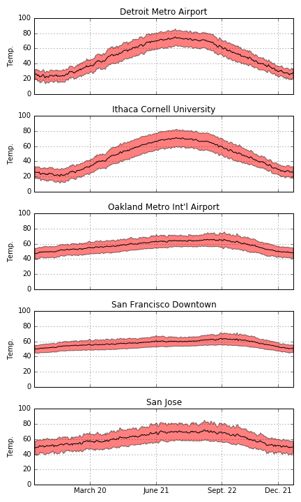
We can also look at the data where we take the average for a year. These plots show the daily average maximum and minimum temperatures (top and bottom of red shaded area) and the halfway point (black line). Again, we can see that some cities have large annual swings (Detroit and Ithaca) and the Bay Area has a relatively small annual swing. In the next post, I’ll do a more careful comparison of the daily and seasonal swings!
Part 2 is here.