The electoral college (EC) is the system used in the US to determine how individual’s votes for president get turned into the numbers that actually determine who becomes president. Each state and D. C. is allocated a number of electors based partially on the population of the state from the last census. The number of electors is equivalent to the number of senators + the number of representatives for each state (D. C. gets 3), see here for details about how the allocations are calculated.
I’ve heard people say that one of the things the EC does is prevent voters in the cities from dominating rural voters. This has always seemed a bit odd to me since, on its face, the allocation is just based on state populations and not demographics. So, I decided to look at the relationship between rural, urban, and total population and how they related to the number of electoral college votes. The code and data for reproducing the plots are here. This is all based on 2010 Census data.
OK, first let’s just look at how many EC votes each state gets. There are a total of 538 electors. The plot below shows the distribution of votes for each state along with a line showing the number each state would be allocated if it was done exactly proportional to population. I’ve labeled a few states of interest.
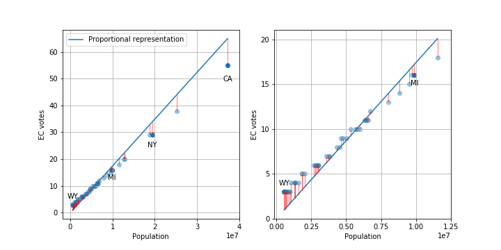
As you can see, states with smaller populations tend to have larger than proportional representation and larger states have fewer votes.
We can look at the number of electoral votes that different people get, i.e. how much is your vote worth in a presidential election. I’m leaving out a lot of important details, like racist voter suppression, the number of actual people able to vote in each state versus total population, and changes in population/demographics since 2010. Given the 538 electors and the 2010 population of 308,745,538, the average person gets. 1.7e-6 or 1.7 millionths of a vote. But, this will vary state-to-state based on the number of electors allocated to each state.
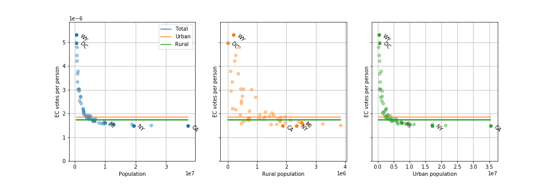
As you can see, the number of EC votes per person varies from about 1.5 millionths (California) to 5.3 millionths (Wyoming), about a factor of 3.5. State with populations above about 10 million all have similar EC votes per person, but small states can have much larger votes per person.
The solid blue line is the national average EC votes per person (1.74 millionths), the solid green line is the national average EC votes for someone living in a urban area (1.72 millionths, barely below the blue line), and the solid orange line is the national average EC votes for someone living in a rural area (1.85 millionths). So, on average, a person living in a rural area has about 8 percent more voting power compared to someone living in an urban area.
But!, the 601,723 people living in urban D. C. have 338 percent more voting power than the 1,880,350 people living in a rural area of California.
Finally, let’s look at how the total state population correlates to the fraction of people living in rural areas.
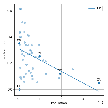
This shows that there is indeed a negative correlation, i.e. smaller states tend to have more people living in rural areas (this leads to the 8 percent difference above).
The thing that I take away from all of this is that the electoral college is actually weighting your vote as a member of the US lower than your vote as member of your state. Because of the current state demographics, it also weights rural votes slightly higher than urban votes, but this is a very small effect compared to the small state versus large state effect (8 vs. 350 percent). So, if you currently live in a big city in California, New York, or Texas and want your vote for president to have more impact, you’ll get more value for your vote if you move to an urban area in Wyoming, D. C., or Vermont rather than a rural area of your state, although you can still have an impact on House and state reps within your state.
I should also note that all of this analysis misses a larger problem of the electoral college: most states have a winner-take-all system where the candidate with the popular majority takes 100 percent of the electoral votes. This means that a candidate who wins 51 percent of the votes in a state gets 100 percent of the EC votes. This system is also used for state reps. and when coupled with gerrymandering, can lead to skews in the state representation compared to state voting demographics.
Edit: Thanks Dylan for catching some spelling errors!