I started this series of posts to understand why the weather in the Bay Area seems different than weather in the places I’ve previously lived. In this post, I’ll show one analysis that I think answers this question. As a reminder, in part 1, I showed some basic visualization of the raw data and an annual summary. In part 2, I went over two analyses that showed that the Bay Area has different weather as compared to Detroit and Ithaca, but neither really got at the heart of why my experience was different.
In this post I’ll present two more analyses. The first shows another interesting difference between the Bay Area and Detroit and Ithaca. The second post really gets at the question that I’ve been trying to answer and introduces the jacket crossing probability (something I made up).
Based on the power-spectrum analysis in part 2, I decided to look in more detail at the daily fluctuations (right side of the plot). For any given day of the year in a city, say May 17th, there is an average temperature, maybe 70 degrees. In addition to the average, there are also the year-to-year fluctuations. These fluctuations can be averaged over all days in a year and plotted.
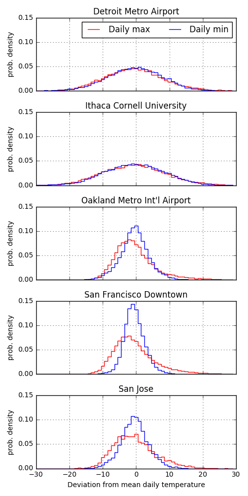
Again, the Bay Area looks very different than Detroit and Ithaca. The distributions of daily high and low fluctuations for Detroit and Ithaca both look very symmetric and fairly Gaussian. The fluctuations have a standard deviation of about 15 degrees and look almost identical for the daily highs and lows. In contrast, the Bay Area distributions are much narrower, with standard deviations less than 10 degrees for all highs and lows. The daily highs tend to have their modes skewed towards lower temperature with longer tails into the highs. The daily low temperatures tend to be more symmetric and have smaller standard deviations. This means that each day’s daily high or low is more predictable in the Bay Area.
Now, to really get at the question of why the Bay Area’s weather is weird I came up with a metric I’m calling the jacket crossing probability: for a given day, what are the odds that the daily high is above and temperature where I’d want a jacket and the daily low is below that temperature. We can plot this probability for all days.
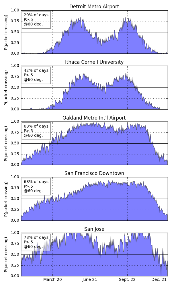
I personally need a jacket when it gets below 60 degrees. If I set this as the threshold, I get the above jacket crossing probabilities. So, Detroit and Ithaca only have two relatively short periods where, with greater than 50% odds, you’ll both want and not want a jacket. They align with late spring and late fall. Similar periods for Oakland and San Francisco extend from spring through summer and into fall. In San Jose, this period extends for almost the entire year outside. So, in the Bay Area, the annoying time when you might both want and not want a jacket extends for the better part of the year. In Detroit and Ithaca, summers are hot and winters are cold and you can prepare for the entire day easily. I think these plots really get at the differences in weather I’ve experienced in the Bay Area.
I’ll follow up with maybe one more post with some additional analyses that others have suggested or done themselves (yay for collaboration!).