Categories
Data Analysis Machine Learning

Markov chains are all you need (to write bad Christmas songs)

Large language models (LLMs) are all the rage these days. They can write (occasionally buggy) code, help you write generic-sounding prose quickly…but can they write ungrammatical Christmas songs? Call me a Luddite, but I’m skeptical.

Luckily, there is a language model out there that doesn’t require 1TB of GPU RAM and a nuclear-reactor-enabled-data-center to .eval(). In fact, with a little determination, you could probably run it natively in a spreadsheet…or on pen-and-paper.

That’s right, I’m talking about Markov chains (of the first order).

But remember when you gave it must be
Let's lay here tonight
But it's a rock
Where the old and the old and that's not a new year
Sure did see mommy kissing santa comes around the mistletoe hung by the king pa rum bu bum
We all year i'll give us annoyed
And i want for christmas christmas is coming to need you better be glad you're sleeping
You my wish come
And a beard that's past
We wish you baby
I'll have a crowded room friends on his sled
Must be

Markov chains are a simple yet ubiquitous probabilistic model that assumes that the probability of what happens next only depends on what is happening now. For a language model, this means that the probability of what word (or token if you’re a nerd) comes next only depends on what the current word is. If we run this process repeatedly, word-after-word, we get things resembling sentences.

I can’t say I’m a huge fan of Christmas pop/rock songs (but I can evaluate it’s likelihood). However, I also think they are corny.

Guide us some decorations of dough
She didn't see
And practicing real famous cat all your soul of mouths to see me
I've got it over
Underneath the jingle bell time for you will you dear if you cheer
You gave you and bright
The very merry christmas girl
Jingle bell jingle bell rock the halls
Let love you dismay
I want it felt like i'm watching it over again
So long long distance
It's lovely weather for christmas all year it always this christmas to succeed

But I don’t want to deal with “gradients” or “descent” or the latest attempt to retcon RNNs (I prefer my BPTT to run sequentially and then vanish…or explode). In the words of Todd Rundgren: “I don’t want to work, I just want to” histogram some lyrics I copied off the internet.

So. I downloaded the lyrics to 30-some pop/rock Christmas songs, fired up a jupyter notebook, deleted some punctuation, and (with a mere 1 vector and 1 matrix) started generating lyrics and posted them here.

Side note: AC/DC released a Christmas song titled: “Mistress for Christmas” in 1990 about Donald Trump cheating on his wife. I had no idea.

You baby
I'm watching it from tears
'cause i believed in trouble out you guys know what time i know
And unto certain
Ding dong
Oh my bedroom fast asleep
A merry-go-round
You and cheer
A beard that's white
I thought you gave you make us some money to the halls
Don't want to set before the world will share this one
Hurry tell him hurry down

Mostly..what I’ve learned…is that Christmas songs are weird and often not really about Christmas at all. I’ll post the data and code soon so that you too can generate bad Christmas lyrics using AI.

My bedroom fast asleep
Ho ho
She got it
You've really can't stay
Oh what a happy new year i'll have termites in trouble out there all over now i've missed 'em
The window at a poor boy child what have some magic reindeer to thy perfect light shine on a button nose
So i thrill when you a cactus
This tear
I'll give all need love breathe
I'll give it to someone
I wouldn't touch you have fun if you want it as opportunistic
The mistletoe last year to town
Categories
Data Analysis Thoughts

The electoral college is states vs. federal, not urban vs. rural

The electoral college (EC) is the system used in the US to determine how individual’s votes for president get turned into the numbers that actually determine who becomes president. Each state and D. C. is allocated a number of electors based partially on the population of the state from the last census. The number of electors is equivalent to the number of senators + the number of representatives for each state (D. C. gets 3), see here for details about how the allocations are calculated.

I’ve heard people say that one of the things the EC does is prevent voters in the cities from dominating rural voters. This has always seemed a bit odd to me since, on its face, the allocation is just based on state populations and not demographics. So, I decided to look at the relationship between rural, urban, and total population and how they related to the number of electoral college votes. The code and data for reproducing the plots are here. This is all based on 2010 Census data.

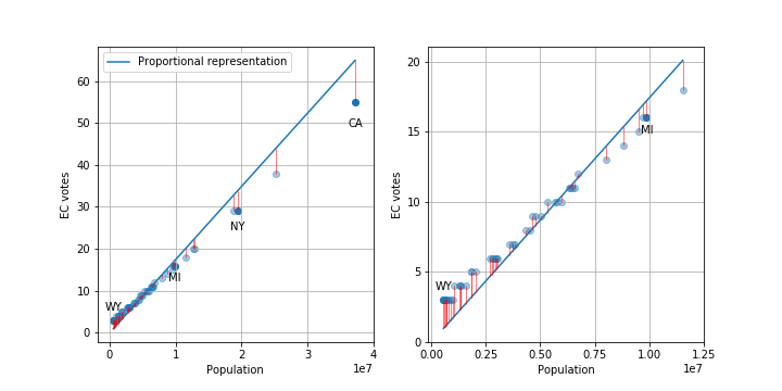
OK, first let’s just look at how many EC votes each state gets. There are a total of 538 electors. The plot below shows the distribution of votes for each state along with a line showing the number each state would be allocated if it was done exactly proportional to population. I’ve labeled a few states of interest.

Plots of the number of electoral college votes per state. Plot on the right in an inset of the bottom left corner of the plot on the left. Blue line is the number of votes states would have if the number of votes was proportional. The red vertical lines are the differences between the proportional number and actual number. (click to get larger version)

As you can see, states with smaller populations tend to have larger than proportional representation and larger states have fewer votes.

We can look at the number of electoral votes that different people get, i.e. how much is your vote worth in a presidential election. I’m leaving out a lot of important details, like racist voter suppression, the number of actual people able to vote in each state versus total population, and changes in population/demographics since 2010. Given the 538 electors and the 2010 population of 308,745,538, the average person gets. 1.7e-6 or 1.7 millionths of a vote. But, this will vary state-to-state based on the number of electors allocated to each state.

EC votes per person for different states and D.C.. Plotted against total state population, rural population, and urban population (rural and urban add up to total). (click to get larger version)

As you can see, the number of EC votes per person varies from about 1.5 millionths (California) to 5.3 millionths (Wyoming), about a factor of 3.5. State with populations above about 10 million all have similar EC votes per person, but small states can have much larger votes per person.

The solid blue line is the national average EC votes per person (1.74 millionths), the solid green line is the national average EC votes for someone living in a urban area (1.72 millionths, barely below the blue line), and the solid orange line is the national average EC votes for someone living in a rural area (1.85 millionths). So, on average, a person living in a rural area has about 8 percent more voting power compared to someone living in an urban area.

But!, the 601,723 people living in urban D. C. have 338 percent more voting power than the 1,880,350 people living in a rural area of California.

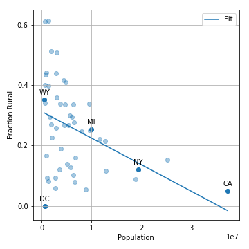
Finally, let’s look at how the total state population correlates to the fraction of people living in rural areas.

Fraction of population which lives in rural areas versus total population. There is a trend that states with larger populations tend to have a smaller fraction of people living in urban areas. For states with a total population less than than 10 million, there is much more variance in the fraction of people living in urban areas.

This shows that there is indeed a negative correlation, i.e. smaller states tend to have more people living in rural areas (this leads to the 8 percent difference above).

The thing that I take away from all of this is that the electoral college is actually weighting your vote as a member of the US lower than your vote as member of your state. Because of the current state demographics, it also weights rural votes slightly higher than urban votes, but this is a very small effect compared to the small state versus large state effect (8 vs. 350 percent). So, if you currently live in a big city in California, New York, or Texas and want your vote for president to have more impact, you’ll get more value for your vote if you move to an urban area in Wyoming, D. C., or Vermont rather than a rural area of your state,  although you can still have an impact on House and state reps within your state.

I should also note that all of this analysis misses a larger problem of the electoral college: most states have a winner-take-all system where the candidate with the popular majority takes 100 percent of the electoral votes. This means that a candidate who wins 51 percent of the votes in a state gets 100 percent of the EC votes. This system is also used for state reps. and when coupled with gerrymandering, can lead to skews in the state representation compared to state voting demographics.

Edit: Thanks Dylan for catching some spelling errors!

Categories
Data Analysis Thoughts

The Bay Area has weird weather

[Update: removed San Diego]

The weather in the San Francisco Bay Area is weird. At least it is weird compared to most of the other places I’ve lived in the US. In the suburbs of Detroit where I grew up and in upstate New York where I went to college, you could be comfortable in the same clothes basically all day or night. If you’ve ever been to the Bay Area, you know that this is not true. It can be in the 50s in the morning and evening and then 80 during the day.

So, I’ve always thought that the Bay Area must have larger daily temperature swings relative to the seasonal swings compared to other places I’ve lived. I wanted to find some historical data to look at this phenomenon and finally found it at the National Oceanic and Atmospheric Administation (NOAA) website, which has a nice search function for different databases.

I finally got around to downloading some data for cities that I’ve lived in or near. I’ll write a few posts looking at the data and also exploring different ways of visualizing the data.

You can find the analysis and plotting code I’m writing on my github here. It’s a work in progress, so there’ll be more updates and cleanup.

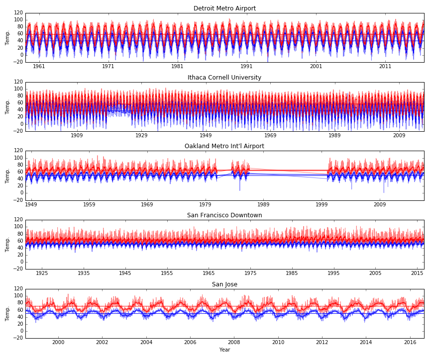
This first post is basically just trying to take a broad look at the data. So, first I just want to plot all of the data for each city. Click on the plot for a larger version. The first plot as the daily high (red) and daily low (blue) along with a local median filtered version (darker squiggly line) and the average over all time (darker straight horizontal line) for the high and low temps. The y-axes are all the same, but notice that the x-axes have different numbers of years.

From this plot I noticed a few things. Different cities have very different annual temperature swings. But, some cities have much larger separation between the daily minimum and maximum. In fact, for San Jose, it looks like the daily swings are almost as large and the annual swings!

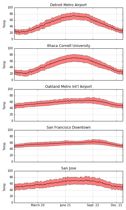
We can also look at the data where we take the average for a year. These plots show the daily average maximum and minimum temperatures (top and bottom of red shaded area) and the halfway point (black line). Again, we can see that some cities have large annual swings (Detroit and Ithaca) and the Bay Area has a relatively small annual swing. In the next post, I’ll do a more careful comparison of the daily and seasonal swings!

Part 2 is here.